Affirm Studio
Affirm Studio allows Control Center administrators to customize content and branding displayed on end-user screens for both Requesters and Approvers within the HYPR Affirm workflow.
For general branding customization (logos, backgrounds, colors), see Custom Branding.
In HYPR 10.7.0 and later, administrators can manage content customizations through the Control Center user interface. The interface provides editing capabilities, preview functionality, and version control features. For API-based configuration, see Affirm Content Customization API.
Overview
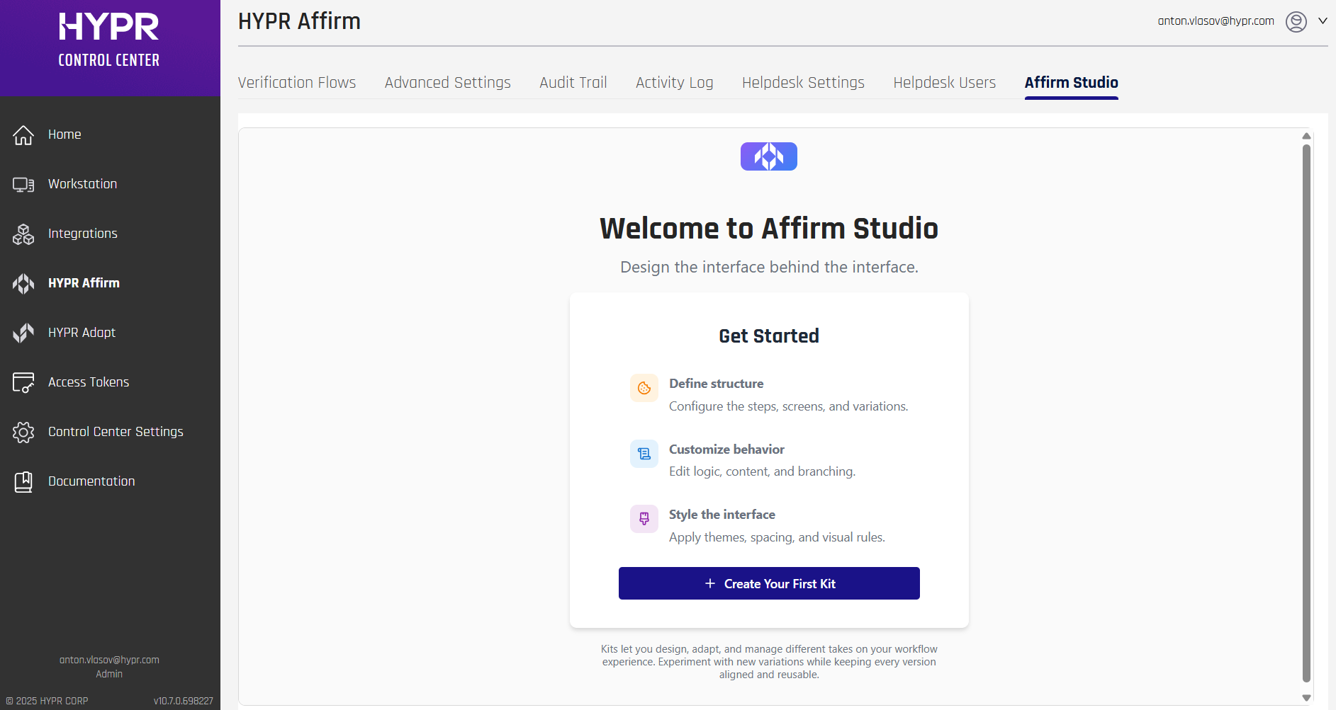
Affirm Studio provides granular control over the content and branding displayed on all Affirm verification screens. This enables organizations to:
- Customize titles, descriptions, and instructional text
- Apply company-specific branding and messaging
- Create consistent user experiences across all verification steps
- Support localized content for global teams
- Track changes through version control
Customizable Screens
The system supports customization for the following verification screens:
Core Verification Screens
- Consent Screen: Initial consent and terms acceptance
- Instructions Screen: Step-by-step guidance for users
- Login Identifier Screen: Username/email input
- Phone Number or Email Screen: Contact information collection
- OTP Screen: One-time password verification
- Location Screen: Location-based verification
Identity Verification Screens
- IDV Await Screen: Waiting for identity verification
- IDV Requestor Report Screen: Verification status reporting
- Document Liveness Screen: Document and biometric verification
- Auto Approval Await Screen: Waiting for automatic approval
Outcome Screens
- Outcome Screen: Final verification results
- Denied Screen: Access denial notification
Content Customization Options
Each screen supports the following customization elements:
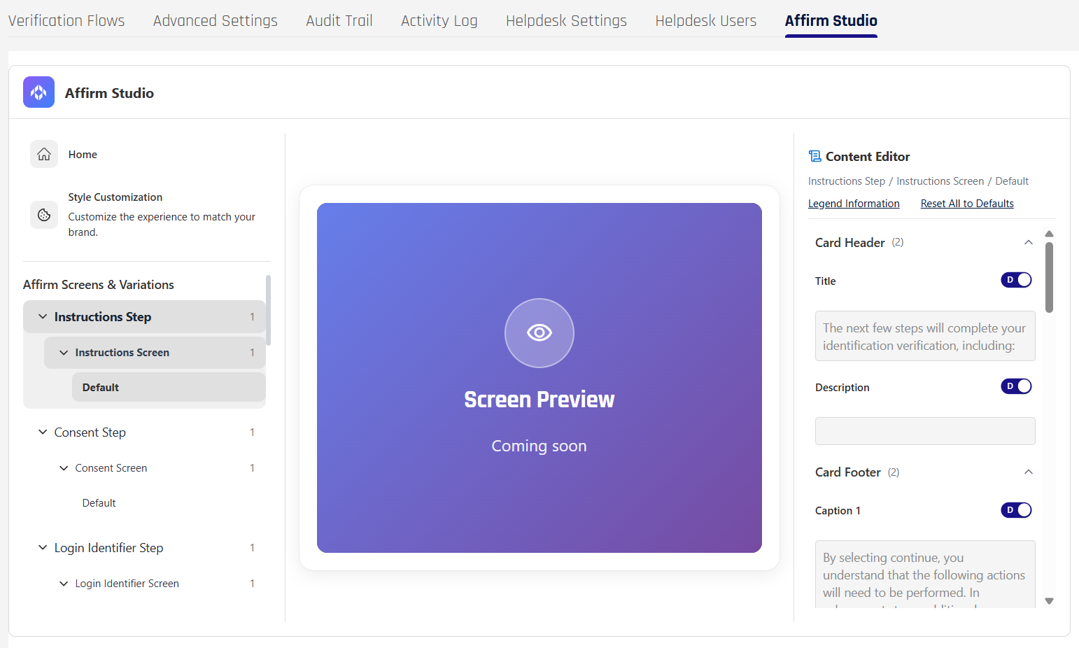
Card Header
- Title: Main screen title
- Description: Screen description text
Card Content
- Main Content: Primary instructional text
- Extra Content: Additional information or tips
Card Footer
- Caption 1: Primary footer text
- Caption 2: Secondary footer text
Button Labels
- Customizable button text for all interactive elements
Style Customizations (Advanced UI)
In addition to content, Affirm Studio supports advanced style customizations so that administrators can align the look and feel of Affirm with corporate branding guidelines.
- Tenant-level themes: Define default visual styles that apply to all Affirm workflows for a tenant.
- Workflow overrides: Where enabled, workflows can reference style customizations that override the tenant defaults for specific flows.
- Visual elements: Styles can include button colors and border radius, typography (font family, size, and color), border visibility and color, and background colors for key interface regions.
- Custom components: Administrators can upload approved HTML snippets for optional UI components such as contextual help buttons or support banners that appear on selected screens.
These style customizations are managed alongside content kits in Affirm Studio and are applied to both HYPR‑native and Onfido‑driven screens within the same workflow, ensuring a consistent branded experience across the full verification journey.
Managing Content Customizations
Content customizations can be managed through the Control Center user interface or via the REST API.
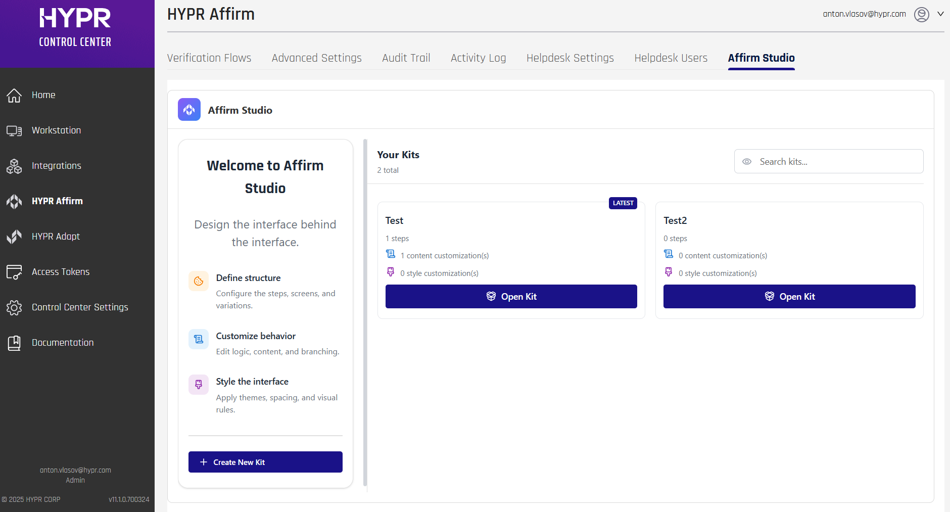
Affirm Studio (via Control Center Interface)
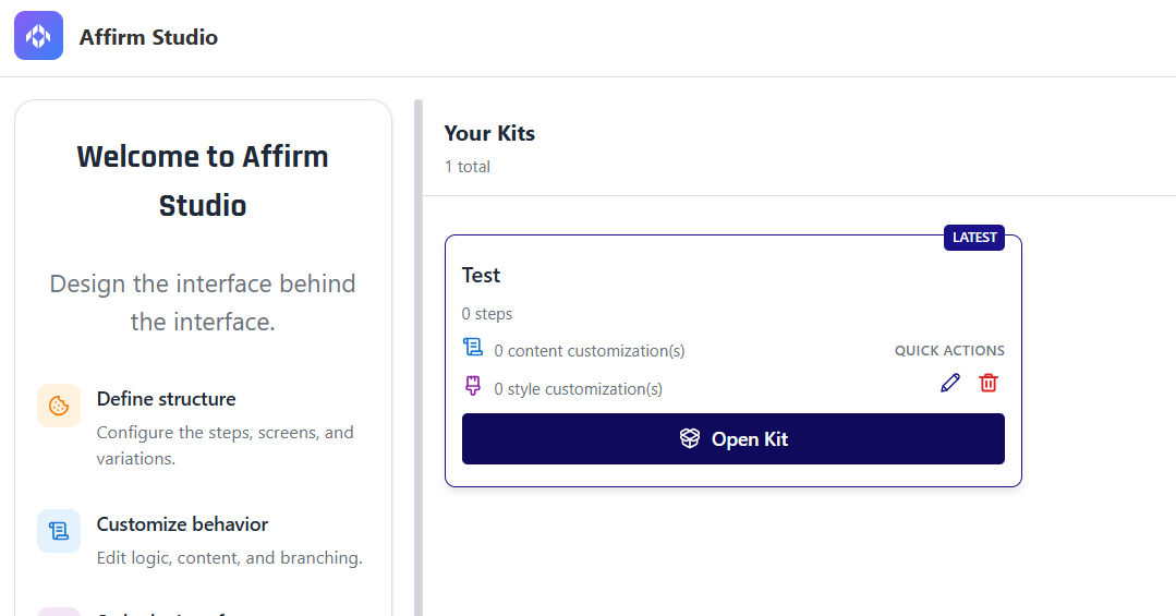
In HYPR 10.7.0 and later, administrators can create, edit, and manage content customizations (called "Kits") directly in Control Center through Affirm Studio:
Navigation:
- Log into HYPR Control Center
- In the left navigation menu, click HYPR Affirm
- Click the Affirm Studio tab in the top navigation bar
Key Features:
- Kit Management: Create, edit, and delete workflow customization kits
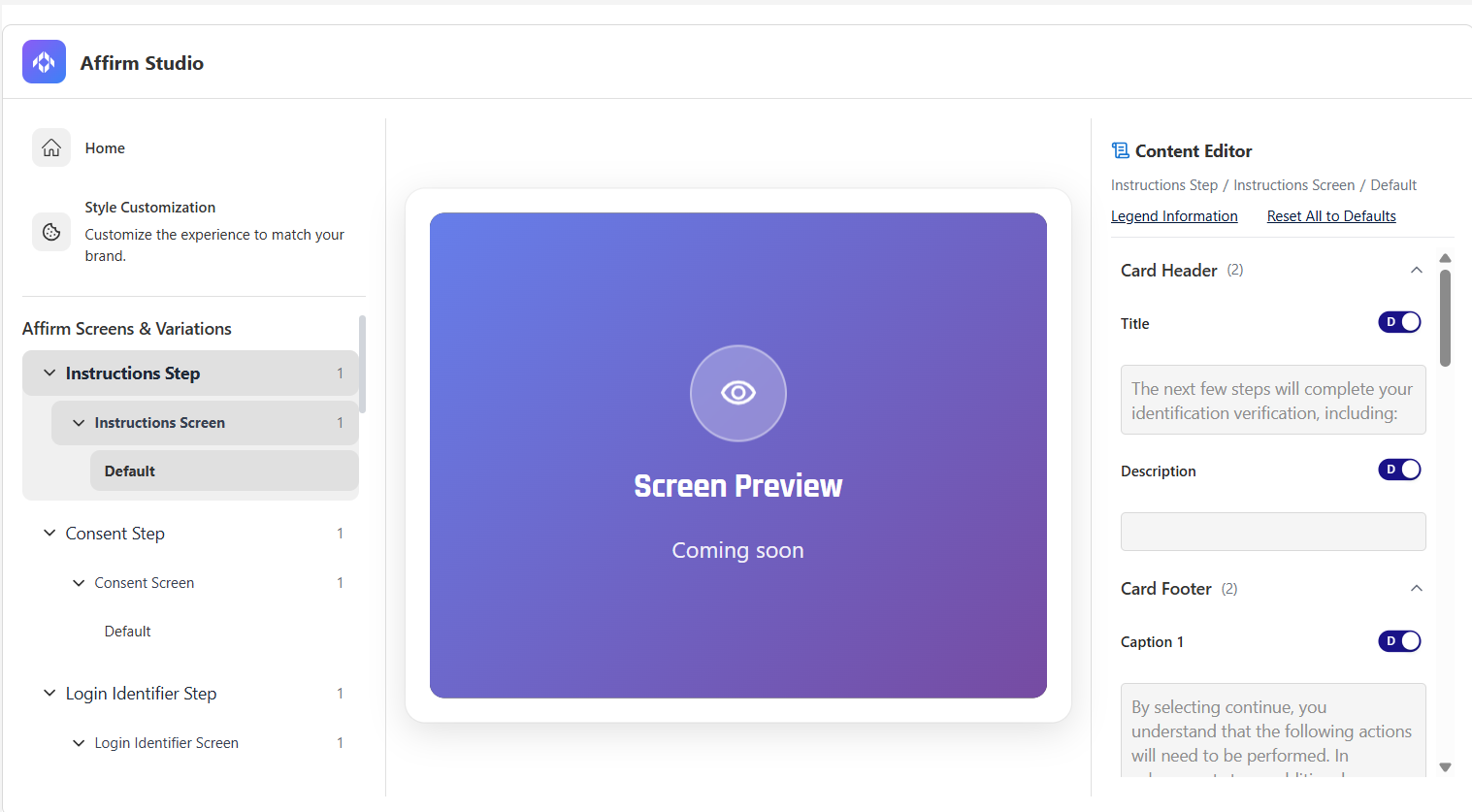
- Step-Based Editing: Edit content for each verification flow step (Instructions, Consent, Login Identifier, OTP, Location, Identity Verification, Outcome, Error)
- Content Editor: Edit Card Header, Card Footer, Button Labels, Error Messages, and Screen Specific Content
- Screen Preview: Review how customized screens will appear to end users (preview functionality)
Workflow:
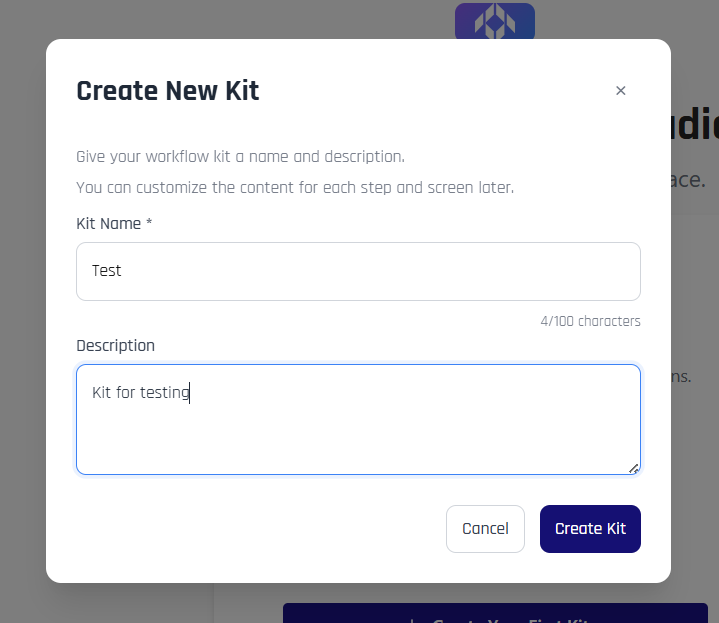
- From the Welcome screen or Kit Management screen, click + Create Your First Kit or + Create New Kit
- Enter a Kit Name and optional Description in the Create New Kit modal
- Click Create Kit to create the kit
- From the Kit Management screen, click Open Kit on the kit you want to edit
- In the Kit Editing screen, select a step from the verification flow in the left panel
- Use the Content Editor in the right panel to configure content for each screen type
- Use the Preview feature in the center panel to review changes before applying them
- The changes are saved automatically
API Configuration
For programmatic configuration, use the REST API endpoints. See Affirm Content Customization API for complete API documentation.
Key API Endpoints:
POST /content-customization- Create new content customizationPOST /content-customization/:id- Update existing content customizationGET /content-customization- List all content customizationsGET /content-customization/:id- Retrieve specific content customization