Affirm Studio
Affirm Studio is the surface for customizing what the requester and approver see during a HYPR Affirm verification flow. Administrators build per-workflow customization kits that override default content (titles, descriptions, instructions, button labels) and visual styling (typography, button colors, layout). The kits are assigned to verification flows; the requester and approver see the customizations the moment they enter the flow.
This page describes the end-user experience of Affirm Studio customizations — what gets branded, which screens are customizable, what visual properties can change. For the admin walkthrough on creating kits, see Configuring End User Screen Customizations.
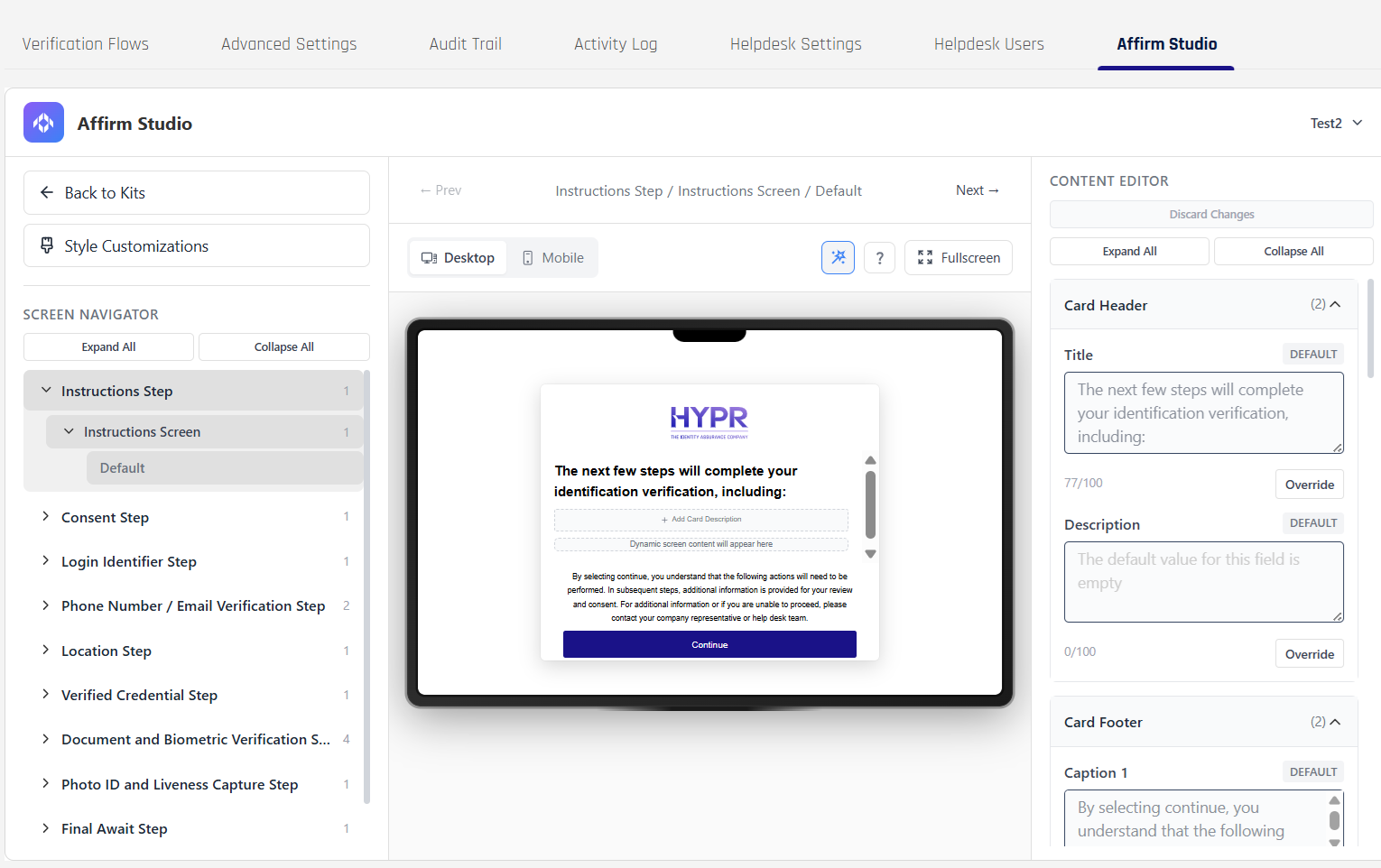
An Affirm Studio editing session previewing a customized verification screen. The kit's content and styling appears to the requester exactly as it does in the preview.
What end users see
When a workflow has an Affirm Studio kit assigned, the customizations appear immediately on the verification screens. A requester completing a verification sees:
- The organization's logo and color theme on the header of every screen (inherited from Custom Branding)
- Per-step screen content (titles, descriptions, instructions, button labels) replaced with the kit's values where the admin has overridden them; un-overridden fields fall back to the HYPR defaults
- Per-step visual styling (typography, button colors, progress indicators, input fields) replaced with the kit's values where the admin has configured them
The approver review surface uses the same kit when the approver reviews an escalated verification.
Desktop and mobile
Affirm verification screens render on both desktop and mobile. The Affirm Studio kit applies to both; the requester sees a consistent experience regardless of device.
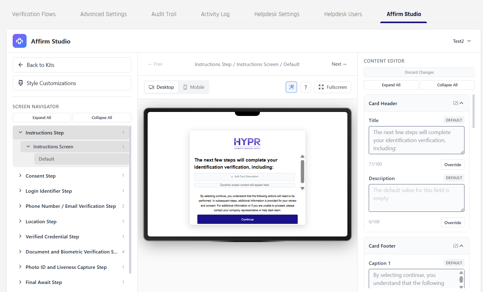
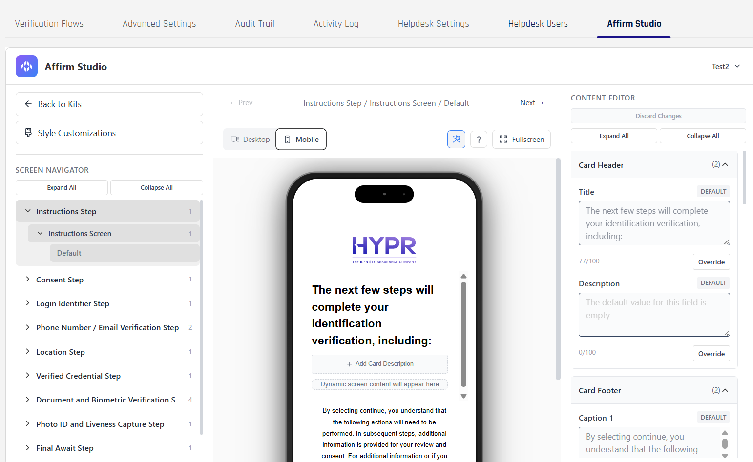
Desktop and mobile preview of the same customized screen. Branding, content, and styling are consistent across viewports.
Customizable screens
The kit can customize the following verification step screens. Steps a workflow does not include simply don't have their screens rendered to the requester — but the kit can still contain customizations for them in case the workflow is updated later.
- Instructions — high-level guidance about what the requester is about to do
- Consent — terms, privacy, and consent acceptance before continuing
- Login Identifier — username or email entry used to identify the requester
- Phone Number / Email Verification — split into the Phone Number / Email screen (channel entry) and the OTP screen (one-time passcode verification)
- Location — collects or confirms location details used in the verification flow
- Verified Credential — prompts the requester to verify a credential (for example by scanning a QR code with an external wallet such as Microsoft Authenticator) and confirms when that credential has been successfully validated
- Document and Biometric Verification — split into the Date of Birth screen, the Identity Verification screen, the Await screen (verification in progress), and the Report Card screen (summary)
- Photo ID and Liveness Capture — guides the requester through capturing ID images and liveness checks
- Final Await — communicates that the overall verification decision is still pending
- Outcome — final verification result and any handoff to a downstream system
- Approver Pre-Verify / Approver Attestation Results / Approver Attest — what an approver sees when reviewing a verification
What content can be customized per screen
Each screen supports a consistent set of content elements:
| Element | What it controls |
|---|---|
| Card Header → Title | Main screen title |
| Card Header → Description | Screen description text |
| Card Content → Main Content | Primary instructional text |
| Card Content → Extra Content | Additional information or tips |
| Card Footer → Caption 1 | Primary footer text |
| Card Footer → Caption 2 | Secondary footer text |
| Button Labels | Customizable button text for all interactive elements |
The admin can override any of these per kit; unmodified elements show the HYPR default text.
What visual styling can be customized
Style customizations apply across all screens in the kit. The available controls are grouped:
| Group | What it controls |
|---|---|
| General | Layout-wide options such as full-screen experience and header background color |
| Logo | Dimensions used to render the tenant logo in the header and, where applicable, in video experiences |
| Typography | Body and heading colors and font sizes used across cards, captions, and inline messages |
| Progress | Colors for the progress track and progress indicator at the top of multi-step flows |
| Primary Button / Secondary Button / Tertiary Button | Background, text, hover, focus, border, and disabled-state styles for the main action buttons, secondary actions, and tertiary links or outline buttons |
| Input | Background, content (text) color, and border settings for text boxes, dropdowns, and other input fields |
| Video | Visual properties specific to video-based steps, such as logo sizing and heading styles used around live-capture or document-and-video experiences |
Related
- Configuring End User Screen Customizations — admin guide for building and assigning Affirm Studio kits
- Affirm Content Customization API — programmatic per-screen content customization
- Custom Branding — cross-product visual baseline (logo, colors, Company Identity)
- SMS Notification Branding — branded SMS messages sent during the flow
- Email Notification Customization — branded email templates sent during the flow