Managing Content Customizations
Content customizations can be managed through the Control Center user interface (Affirm Studio) or via the REST API.
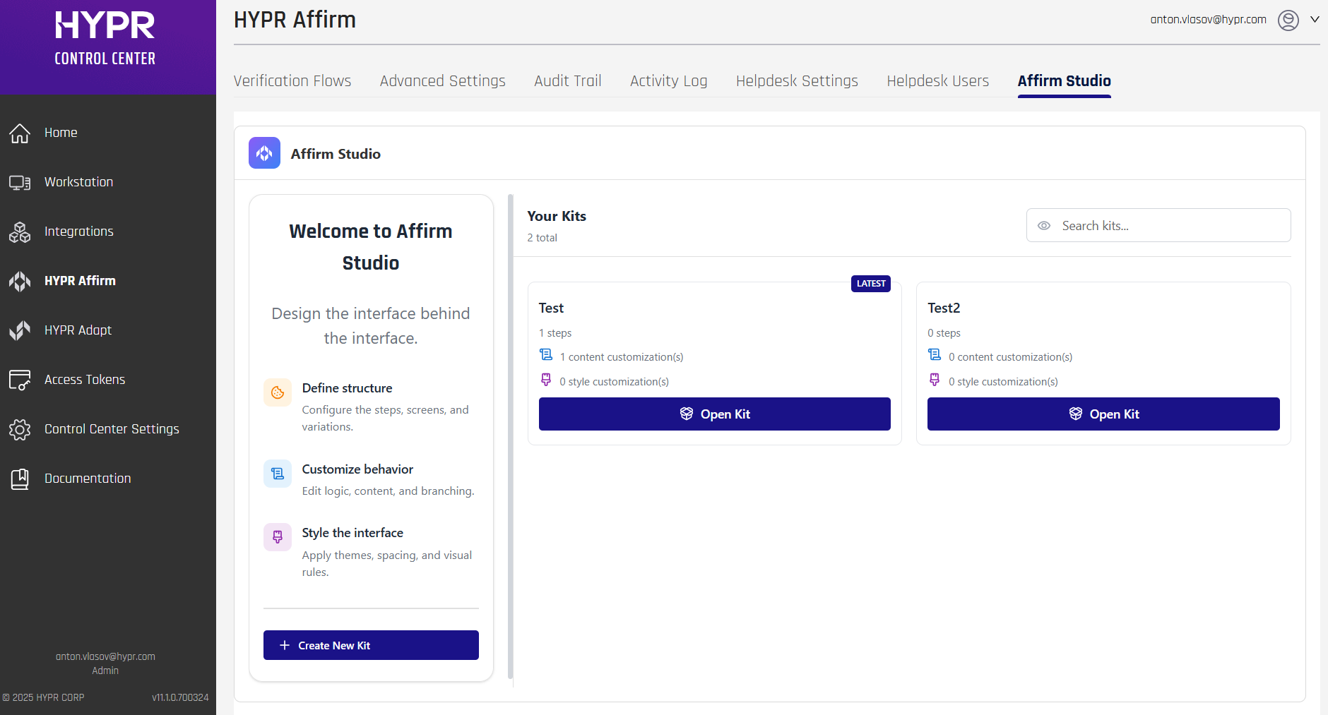
Affirm Studio
Affirm Studio allows Control Center administrators to customize content and branding displayed on end-user screens for both Requesters and Approvers within the HYPR Affirm workflow.
Custom Branding is for HYPR components in Control Center (for example, company identity/logo/background) and notification template branding (for example, SMS branding and email notification templates).
If you are customizing the end-user verification screens inside HYPR Affirm (titles, descriptions, instructions, button labels, and per-step screen styling), use Affirm Studio.
For general branding customization (logos, backgrounds, colors), see Custom Branding.
In HYPR 10.7.0 and later, administrators can manage content customizations through the Control Center user interface. The interface provides editing capabilities, preview functionality, and version control features. For API-based configuration, see Affirm Content Customization API.
You can access Affirm Studio by navigating to the Affirm Studio tab on the HYPR Affirm section of Control Center.
Overview
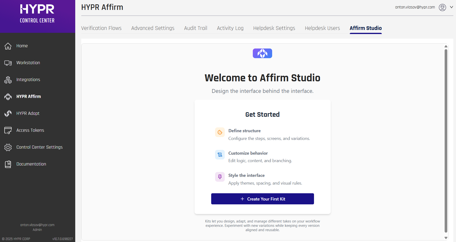
In HYPR 10.7.0 and later, administrators can create, edit, and manage content customizations (called "Kits") directly in Control Center through Affirm Studio.
Affirm Studio provides granular control over the content and branding displayed on all Affirm verification screens. This enables organizations to:
- Customize titles, descriptions, and instructional text
- Apply company-specific branding and messaging
- Create consistent user experiences across all verification steps
- Support localized content for global teams
- Manage multiple customizations at the same time
Navigation:
- Log into HYPR Control Center
- In the left navigation menu, click HYPR Affirm
- Click the Affirm Studio tab in the top navigation bar
Key Features:
- Kit Management: Create, edit, and delete workflow customization kits
- Step-Based Editing: Edit content for each verification flow step (Instructions, Consent, Login Identifier, OTP, Location, Identity Verification, Outcome, Error)
- Content Editor: Edit Card Header, Card Footer, Button Labels, Error Messages, and Screen Specific Content
- Screen Preview: Review how customized screens will appear to end users (preview functionality)
Workflow:
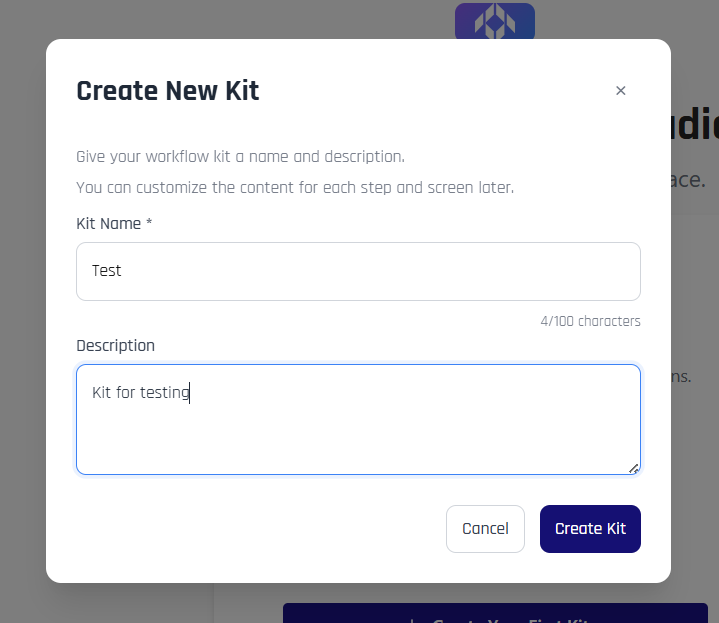
- From the Welcome screen or Kit Management screen, click + Create Your First Kit or + Create New Kit
- Enter a Kit Name and optional Description in the Create New Kit modal
- Click Create Kit to create the kit
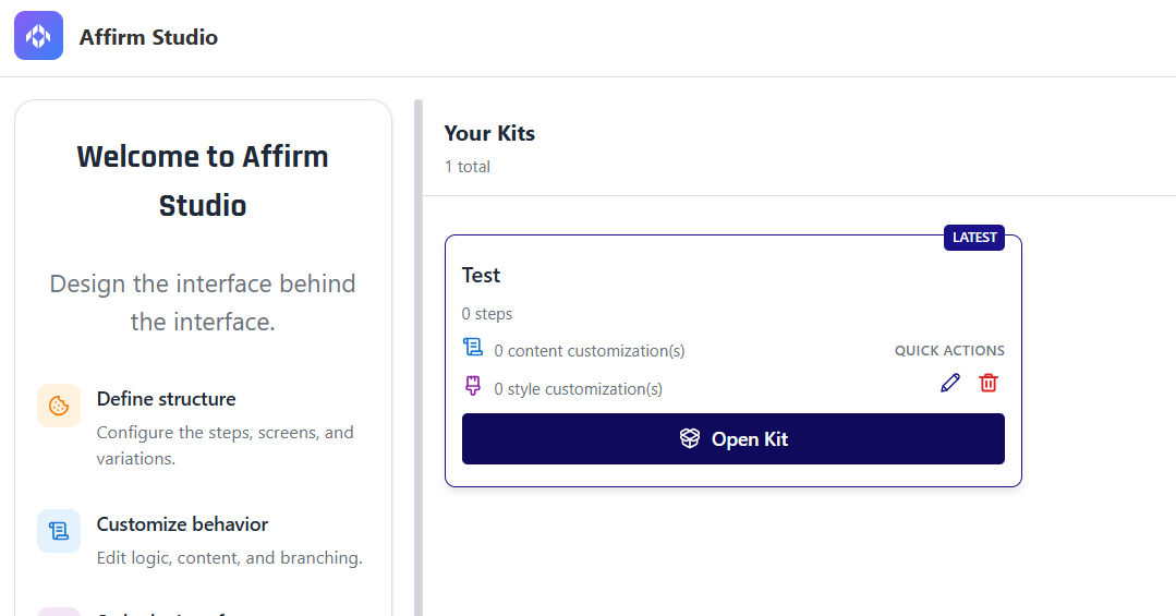
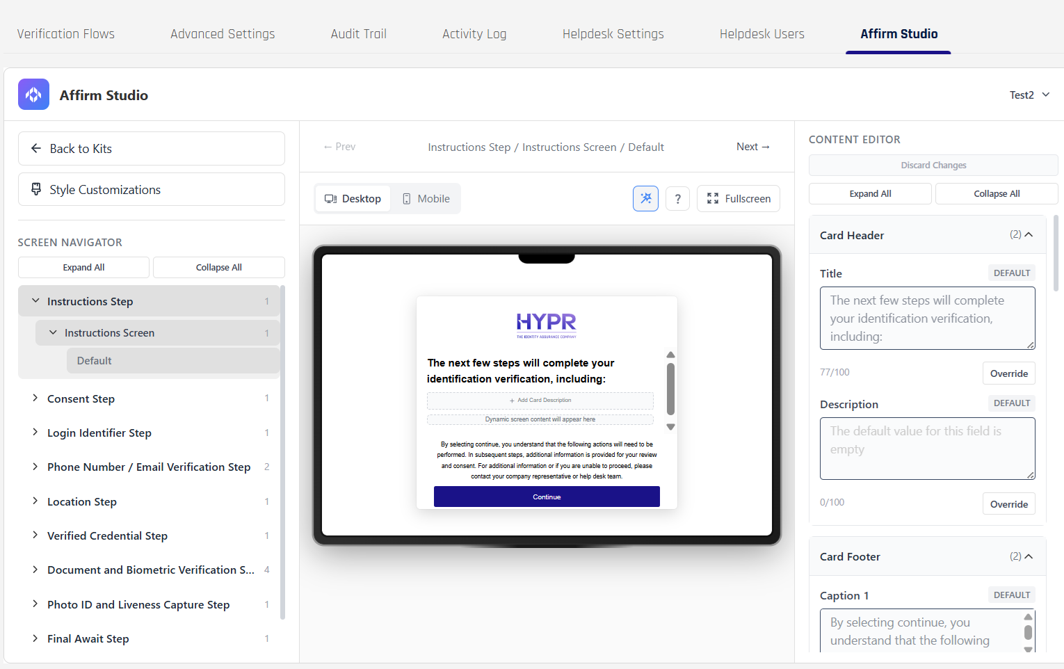
- From the Kit Management screen, click Open Kit on the kit you want to edit.
- In the Kit Editing screen, select a step from the verification flow in the left panel.
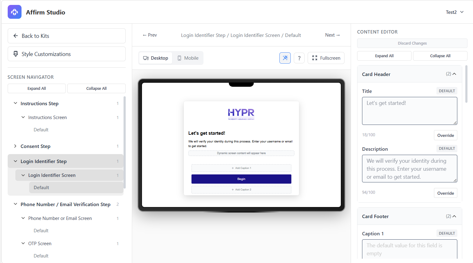
- Use the Content Editor in the right panel to configure content for each screen type.
- Use the Preview feature in the center panel to review changes before applying them.
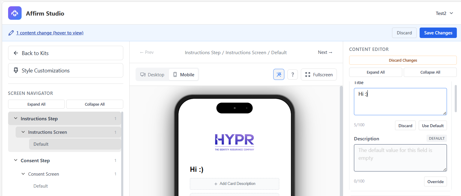
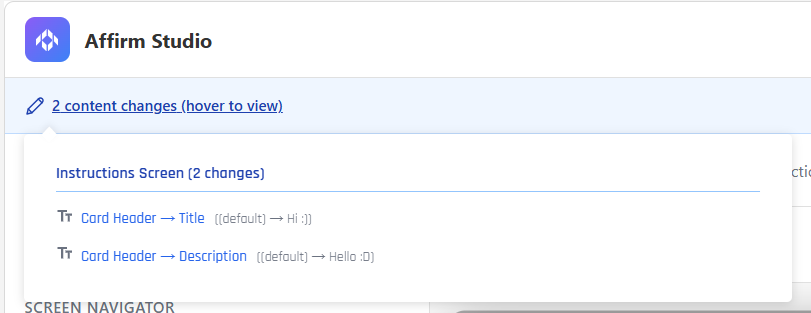
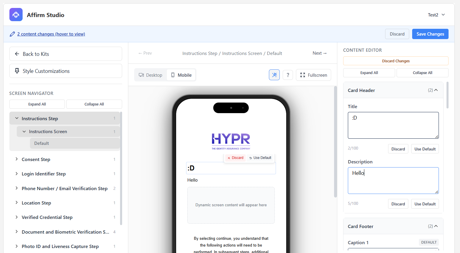
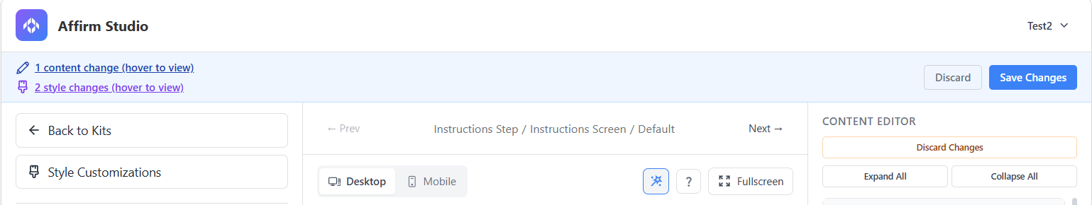
- In HYPR 11.1.0+, as you make edits, Affirm Studio tracks unsaved changes instead of auto‑saving immediately. When there are pending edits, a notification bar appears at the top of the pane showing how many changes are pending and offering options to Save or Discard those changes. You can hover over the “n changes (hover to view)” text in this bar to open a menu listing each change as an element.
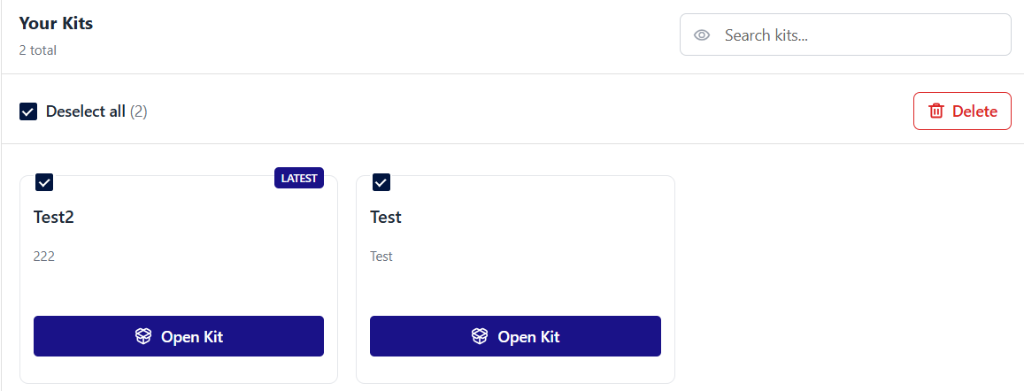
Kits can also be managed via the Your Kits menu that appears when you click the Affirm Studio tab. You can duplicate a kit, edit a kit's name and description, and delete a kit using the Quick Actions menu that appears when you hover your cursor over a kit.

You can also delete outdated kits and kits you no longer need in bulk — you can select several kits by marking the checkbox in the upper left corner of a kit and clicking the Delete button.
::: Coming Soon Currently, only Delete is available as a bulk action. More bulk actions will become available in future versions of HYPR. :::
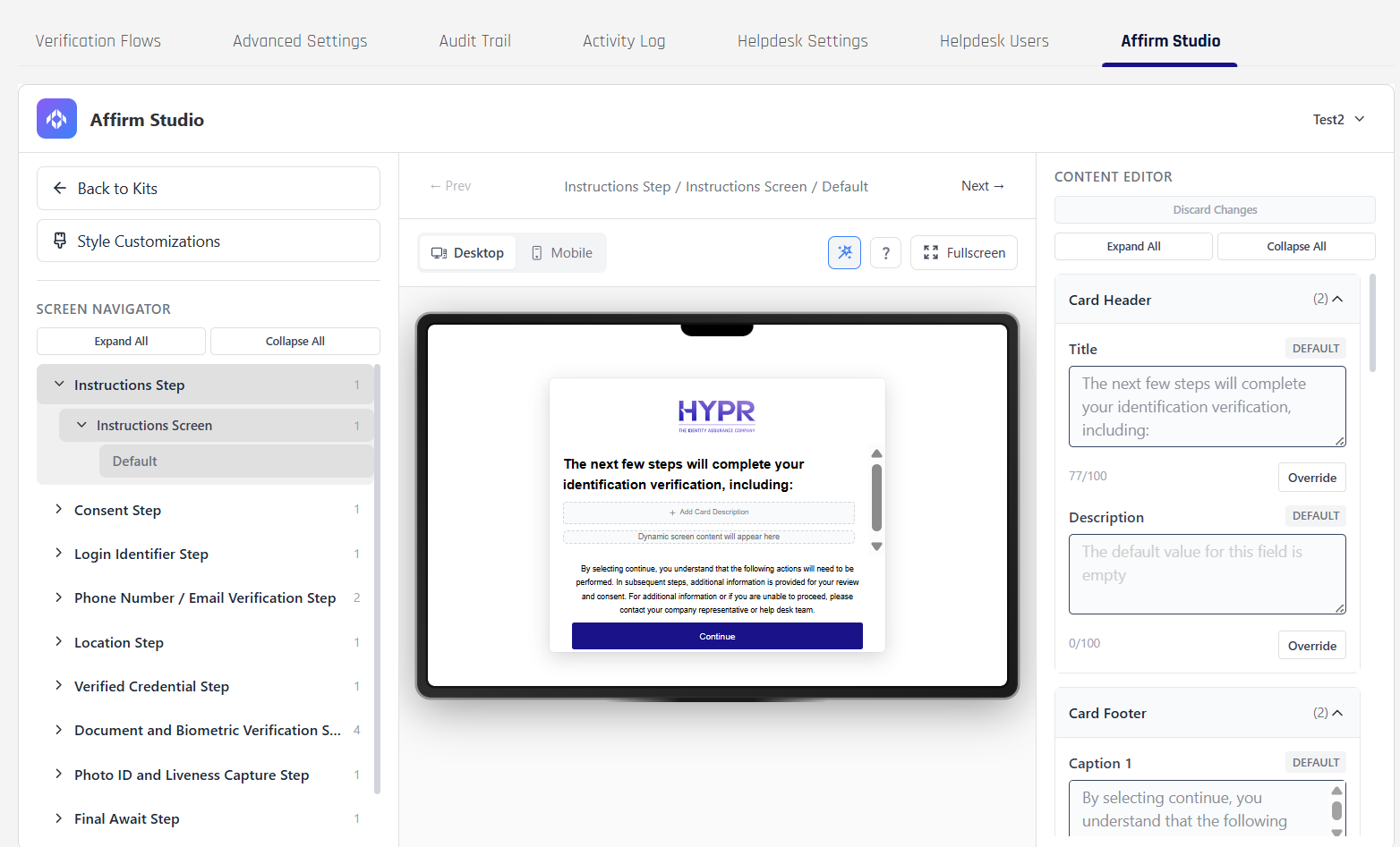
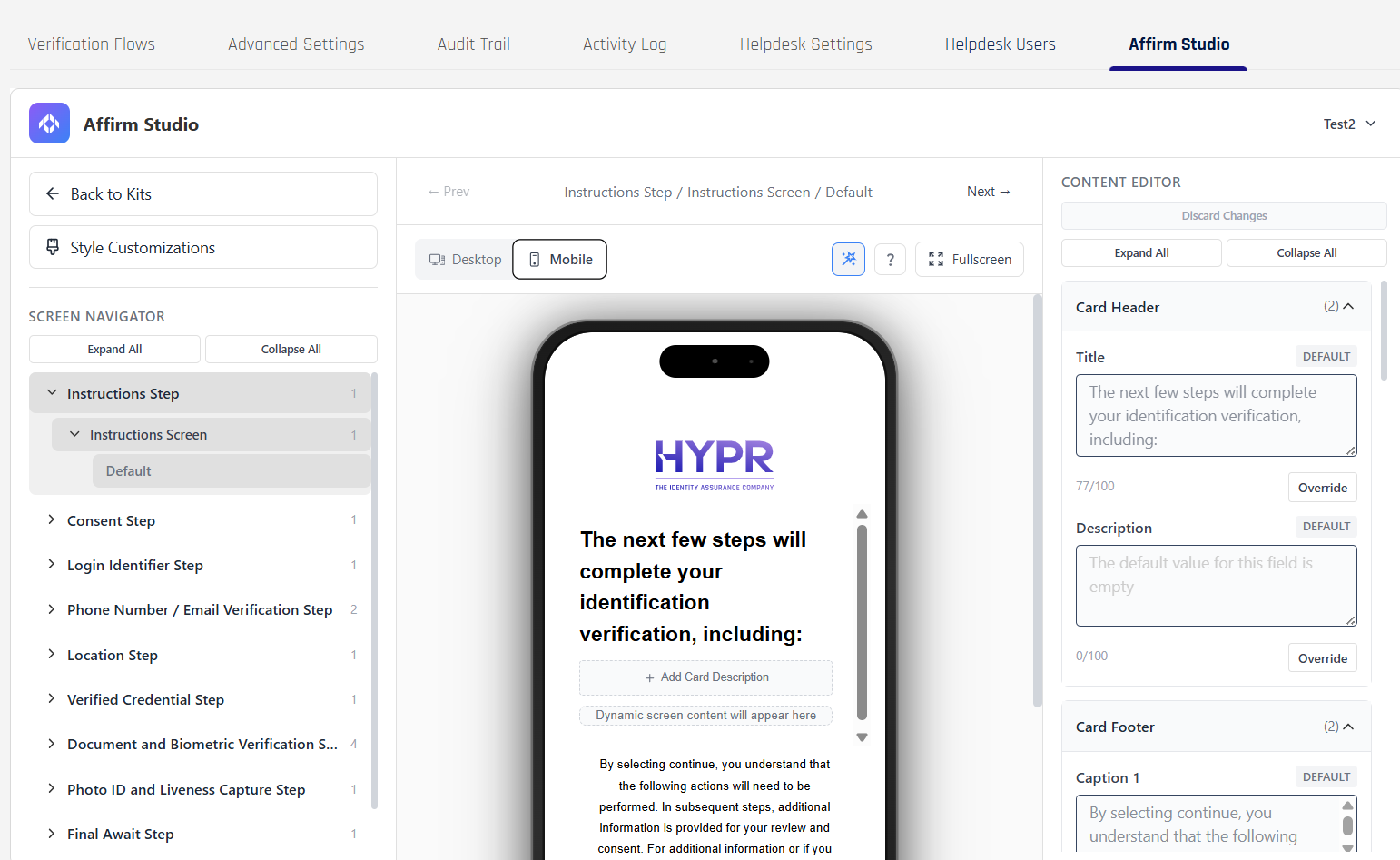
Navigating Screens and Styles
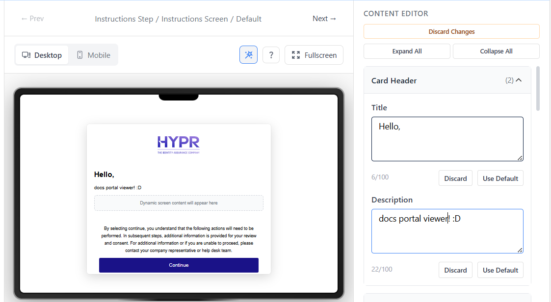
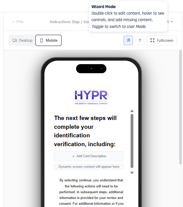
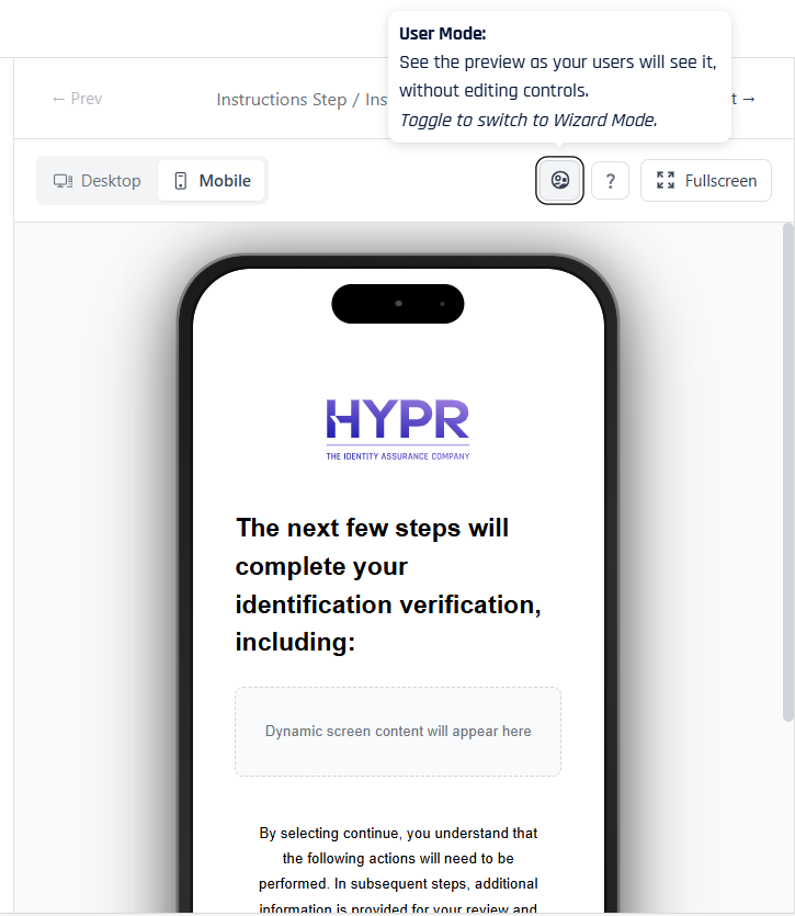
When you edit a kit, the center of the screen shows a live preview of the currently selected step. The preview toolbar lets you switch between Desktop and Mobile layouts so you can confirm that headings, instructions, and buttons render correctly on different devices. To do so, you can click the Desktop and Mobile toggles above the preview screen.
Desktop view:
Mobile view:
Above the preview, a mode toggle controls how much of the design UI is visible:
-
In Wizard Mode, you see editor affordances such as empty fields, “Add Caption” rails, and inline controls that make it easy to configure each card.
-
In User Mode, these editing elements are hidden so the canvas looks the way an end user will experience it during a real verification flow.
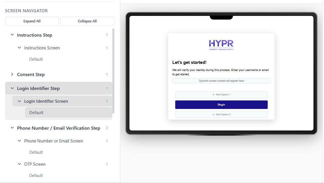
Within a kit, the left-hand panel normally shows the Screen Navigator, organized by verification steps (such as Instructions, Consent, Phone Number / Email Verification, and Approver Attestation). Selecting a step here drives which screen appears in the preview and which set of content fields are available in the editor.
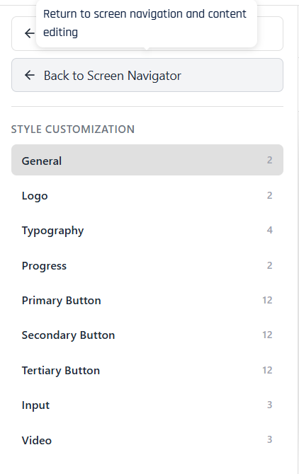
Under the Back to Kits link, the Style Customizations button switches this panel from the Screen Navigator to the Style Customization menu. In this mode you work with global visual settings such as typography, button colors, and video styling for the kit instead of per-screen text. To return to screen‑level editing, use the Back to Screen Navigator option that appears in place of Style Customizations.

Customizable Screens
The system provides built-in customization options and tools for the following verification steps and screens:
- Instructions Step – Instructions Screen: High-level guidance about what the requester is about to do.
- Consent Step – Consent Screen: Terms, privacy, and consent acceptance before continuing.
- Login Identifier Step – Login Identifier Screen: Username or email entry used to identify the requester.
- Location Step – Location Screen: Collects or confirms location details used in the verification flow.
- Verified Credential Step – Verified Credential Screen: Prompts the requester to verify a credential (for example by scanning a QR code with an external wallet such as Microsoft Authenticator) and confirms when that credential has been successfully validated.
- Photo ID and Liveness Capture Step – Photo ID and Liveness Screen: Guides the requester through capturing ID images and liveness checks.
- Final Await Step – Final Await Screen: Communicates that the overall verification decision is still pending.
Phone Number / Email Verification Step
- Phone Number or Email Screen: Collects the contact channel that will be verified.
- OTP Screen: One-time passcode verification sent to the selected channel.
Document and Biometric Verification Step
- Date of Birth Screen: Captures or confirms date-of-birth information.
- Identity Verification Screen: Shows identity-verification status and supporting details.
- Await Screen: Indicates that document and biometric checks are still in progress.
- Report Card Screen: Summarizes document and biometric verification results for reviewers.
Approver Attestation Step
- Approver Pre Verify Screen: Provides context and checks for approvers before attesting.
- Approver Attestation Results Screen: Displays the outcome of approver review.
- Approver Attest Screen: Allows approvers to record their final attestation decision.
Content Customization Options
Each screen supports the following customization elements and editing features:
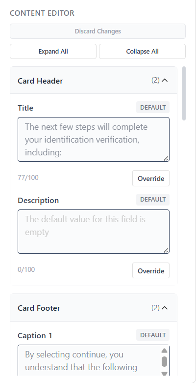
Card Header
- Title: Main screen title
- Description: Screen description text
Card Content
- Main Content: Primary instructional text
- Extra Content: Additional information or tips
Card Footer
- Caption 1: Primary footer text
- Caption 2: Secondary footer text
Button Labels
- Customizable button text for all interactive elements
Style Customizations (Advanced UI)
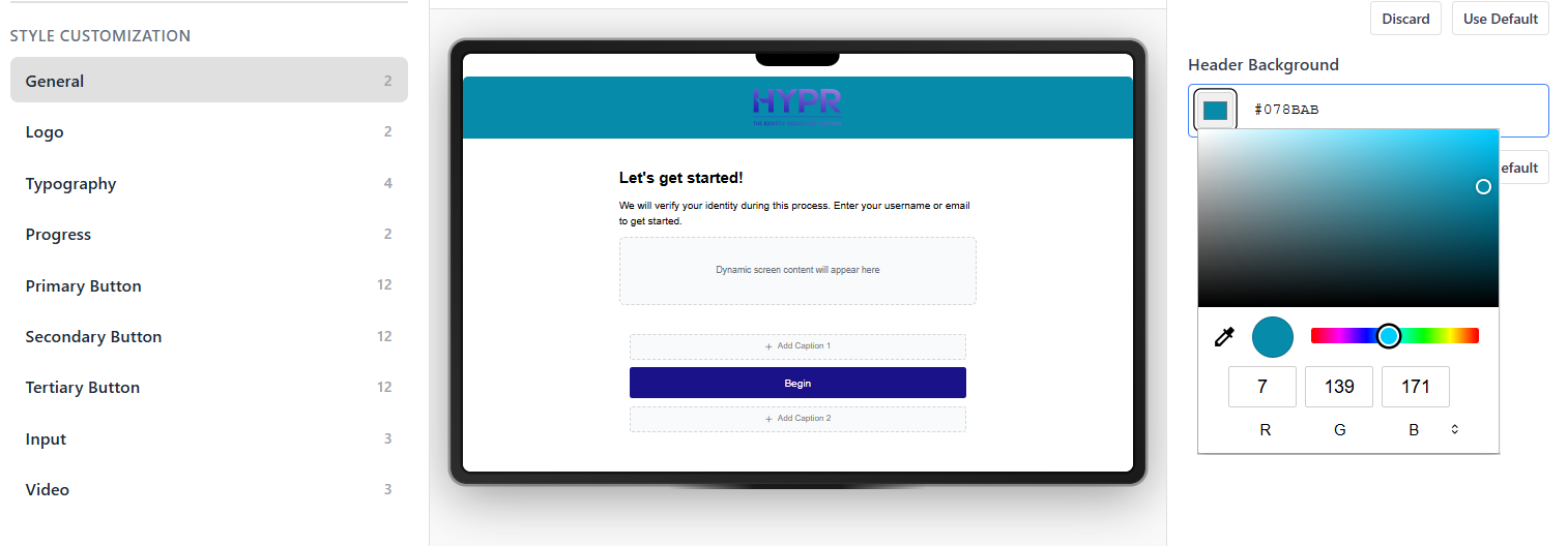
Additionally, the visual design of the different screens can be customized as well. Style customization works alongside screen content to control the overall look and feel of Affirm flows for a kit. The Style Customization menu is organized into the following groups:
- General: Layout-wide options such as enabling a full-screen experience and setting the header background color.
- Logo: The dimensions used to render the tenant logo in the header and, where applicable, in video experiences.
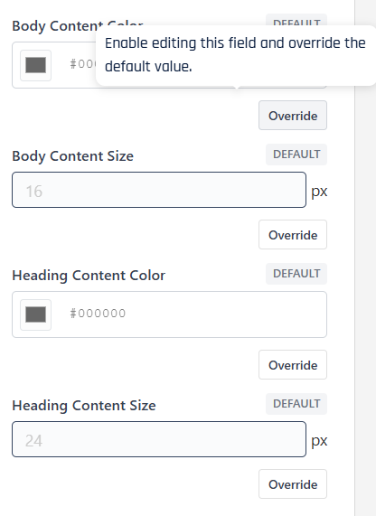
- Typography: Body and heading colors and font sizes that apply across cards, captions, and inline messages.
- Progress: Colors for the progress track and progress indicator shown at the top of multi-step flows.
- Primary Button / Secondary Button / Tertiary Button: Background, text, hover, focus, border, and disabled-state styles for the main action buttons, secondary actions, and tertiary links or outline buttons.
- Input: Background, content (text) color, and border settings for text boxes, dropdowns, and other input fields.
- Video: Visual properties specific to video-based steps, such as logo sizing and heading styles used around live-capture or document-and-video experiences.
Style settings are saved with the kit.
Field Overrides and Pending Changes
By default, content and style fields inherit values from the underlying workflow and tenant configuration. In Affirm Studio, each field shows its current source. To change a field for a particular kit, click Override next to that field. The control unlocks and accepts your custom value, while the Use Default and Discard actions let you quickly revert to the inherited setting or undo a local edit.
As you override fields or adjust style settings, Affirm Studio tracks unsaved changes at the kit level. When there are pending edits, a notification bar appears at the top of the pane indicating how many content and style changes are in progress. From this bar you can review the list of individual changes and choose to Save or Discard them, keeping it clear when a kit has uncommitted updates.
API Configuration
For programmatic configuration, use the REST API endpoints. See Affirm Content Customization API for complete API documentation.
Key API Endpoints:
POST /content-customization- Create new content customizationPOST /content-customization/:id- Update existing content customizationGET /content-customization- List all content customizationsGET /content-customization/:id- Retrieve specific content customization